THE PROBLEM
Many small businesses fail within their first few years.
The state of marketing and oversaturation has created a space where businesses that spend a lot of money of marketing succeed. But what about the businesses that start with less funding?
THE SOLUTION
An app that focuses on marketing these small businesses and encourages users to support local, minority owned businesses.
Today's faced paced environment gives businesses a few seconds to grab people's attention. We wanted to slow down this pace and give these businesses the chance they deserve.

MY ROLE
I led the redesign of the For The People app and conducted UX research using surveys and Maze.
Our team picked up this project from a different team, but our client had major changes she wanted us to make. This app is currently in development and has been handed off to a different team as of May 2024.
OUR CLIENT'S VISION
IDEATION
Teamwork is key.
Our team took the time to define everyone's roles and ensure that our sprints would last an appropriate amount of time.

USER FLOWS
Defining each of the key features of our app.
Based on our survey, we identified major routes our users would take:
The user can favorites businesses and come back to them later.
Filters help the user find a new businesses.
Reviews are written by any user.

LOFI
Our initial lo-fi of our app had two main priorities: visibility and intuitively.
We wanted the filters to be front and center when the users opens the app, and we also wanted them to have their specialized business list that is catered to their past searches. Once we got our lo-fi approved by our client, we moved on to building our brand.

BRANDING
Representation is a key part of our brand.
Our client wanted a dynamic logo that would be able to change based on what we were promoting that month or day. For example, our rainbow logo would be dedicated to pride month. We refrained from using stereotypical colors for races as we and our client did not think it would be appropriate.

For our color palette, we assessed our options and landed on a monochromatic green color palette. Green, in terms of food, typically indicates freshness so we felt that that it was appropriate for an app that primarily consists of restaurants.

HI-FI
Bringing color to our lo-fi.
For our first iteration, I was in charge of the homepage of our app as well as elements of the favorites page. Although there were a few changes to be made in discussion, we decided to stay mostly true to the original lo-fi design we created.

FEEDBACK
We used Maze to determine how well we did.
We had about 20 participants test five tasks:
Login into our app. Assume you are already a member.
Sign up for a business account.
Go to the notifications page and turn off your notifications.
Search up a restaurant.
Navigate to the favorites page and favorite a restaurant.

Heatmaps of tested pages
Tasks 1, 3, and 5 had a success rate of
Task 2 had a mis-click rate of
Task 2 had a direct success rate of
We concluded the user flows of task 1, 3, and 5 needed little to no adjustment when moving forward in our final designs of the app. However. we had the most friction with task 2: Sign up for a business account. Making an easy process for businesses to sign up was one of our goals, and this data helped us understand that we needed visible separation at the start of our account creation flow.

Success flow of task 2
Additionally, our client gave us feedback pertaining to the visual aesthetics of the app. She requested the color palette to be changed to something less common in this niche. She also wanted us to experiment with different orientations for the filters on our homepage because only six were displayed at one moment. Our team went back to the drawing board and discussed new possible color palettes.
COLOR PALETTE
Avoiding stereotypes was a challenge.
For color palette, we put a bigger emphasis on a monochromatic scale to remove the politics of associating ethnicities with certain colors. Our client ended up choosing a light blue palette to represent a soothing, trustworthy environment.

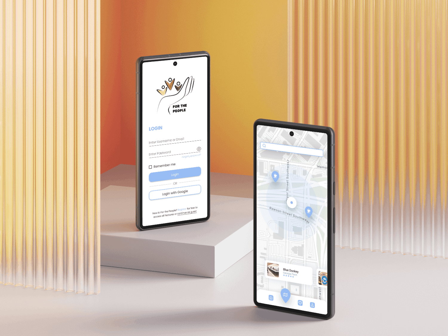
FINAL DESIGNS
We fixed the issues in our designs.
We put an emphasis on visual aesthetics that stand out, better button clarity to prevent mis-clicks, and a more intuitive account creation flow. As for the filter buttons on the main homepage, we decided to reformat the buttons entirely to create more space for more filters and better indicate it was indeed a filter rather than a page traversal button. Lastly, we added an additional page at the beginning of our account creation flow to better account for businesses that are logging in. This change allowed businesses to directly make an account or log in without having to go through the same flow as a user.

EXPO PRESENTATION
The final leap.
Our team got to present For The People at an expo event full of small start up companies promoting their apps. We got to speak to working professionals in the tech industry and gathered insights on how to further this concept on a larger scale.
This was the last day we were contracted to work on For The People. The development of this app was handed off to our client in May 2024.

LESSONS LEARNED

